You found a wallpaper you love. You set it. And now you can’t read half your desktop icons because the text blends into a bright cloud or a white gradient in the corner where your files sit.
It’s annoying. And it happens more than it should.
The fix isn’t “just use a dark wallpaper.” The fix is thinking about where your icons actually live on screen and what the wallpaper is doing in those specific spots.
The icon zone problem
On Mac, desktop icons sit on the right side. On Windows, they default to the left. Either way, your icons need a relatively calm, consistent region behind them to stay readable. If that region has a bright highlight, a detailed texture, or a sharp color transition, icon labels become hard to read.
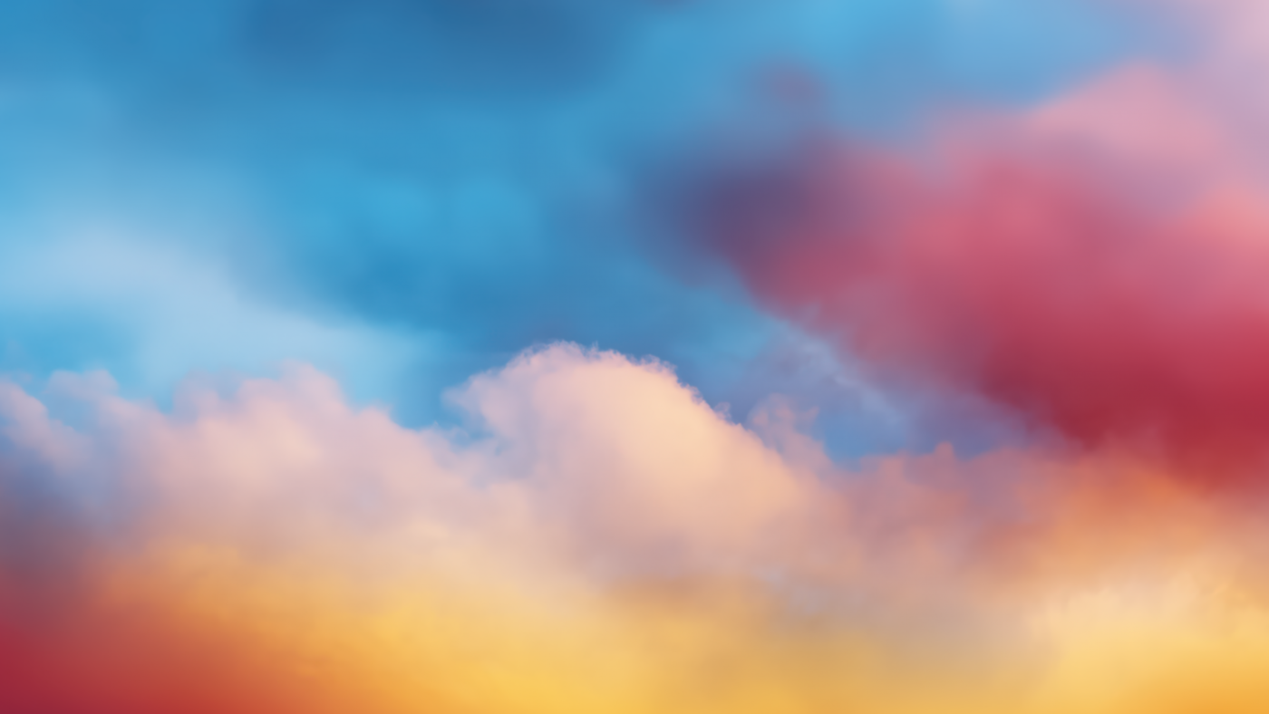
This sunset wallpaper is beautiful, but notice the bright orange and yellow hitting the right third of the frame. On a Mac, that’s exactly where your icons live. White icon labels on bright orange are borderline unreadable.
What works
Wallpapers where the edges and corners are darker or more uniform than the center. This is actually how a lot of Apple’s stock wallpapers are designed. The interesting stuff happens in the middle. The edges are calmer.
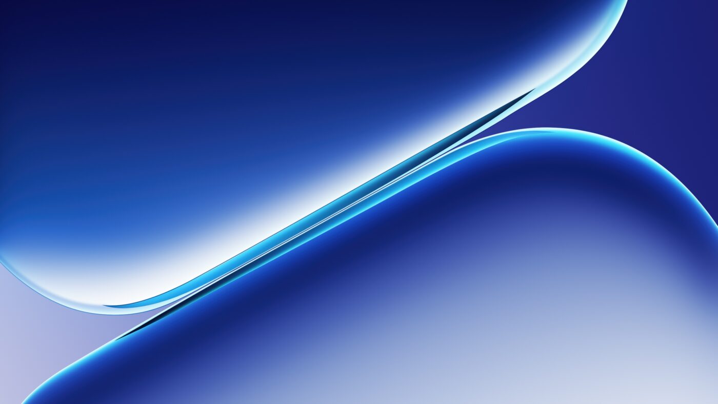
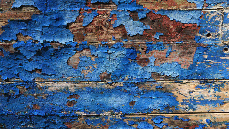
Abstract and gradient wallpapers do this naturally. The visual weight tends to be centered, and the edges fade out. Your icons sit in the quieter zone.
Space wallpapers also work well because the edges of the frame are usually just black void with stars. Perfect for icon readability.
The phone version of this problem
On phones it’s even worse. Your app icons cover most of the screen, the clock and widgets sit on top, and the wallpaper has to work behind all of it. A busy photo wallpaper on a phone makes everything look cluttered.
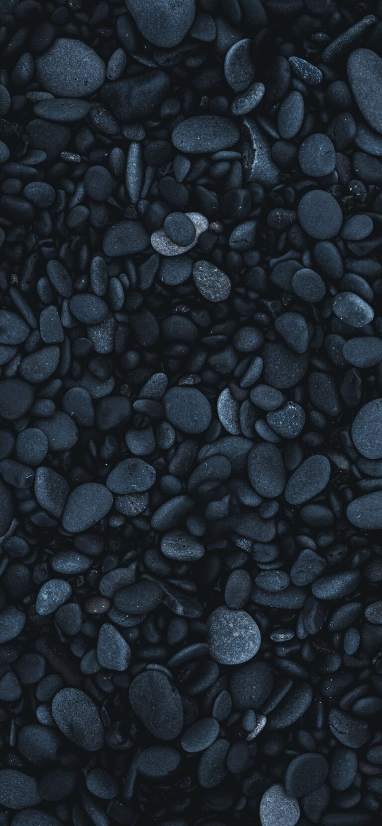
The best phone wallpapers are the ones where the visual interest is concentrated in the center or bottom — areas that get covered less by icons and widgets. Dark wallpapers with a subtle glow in the middle work particularly well. The status bar at the top stays readable, and the dock at the bottom has contrast.
Quick test
Before committing to a wallpaper, set it and then actually look at your desktop with all your usual icons visible. Don’t look at the wallpaper. Look at the icons. Can you read every label? Can you distinguish every icon from the background?
If yes, keep it. If you’re squinting at anything, move on.
On phones, check the lock screen too. Can you read the time and date clearly? Are notifications legible against the background? If not, the wallpaper is working against you.
Browse wallpapers with calm edges: Minimal & Clean Desktops, Blue Gradients, or Space.