Most people default to a landscape photo as their wallpaper. A mountain, a beach, a sunset. And it usually looks… fine. Just fine. Not bad, not amazing. It sits behind your apps and you stop noticing it after a day.
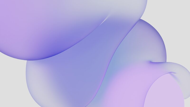
Gradients are different. They don’t try to be a photo. They don’t compete with your icons or your dock. They just set a tone.
Photos are designed to be looked at — wallpapers aren’t
Here’s the thing nobody talks about: landscape photos are designed to be looked AT. They have a subject, a focal point, details you’re supposed to notice. But on a desktop, they’re background. You’re not looking at them. You’re looking at Figma, or your browser, or Slack. The wallpaper is peripheral.
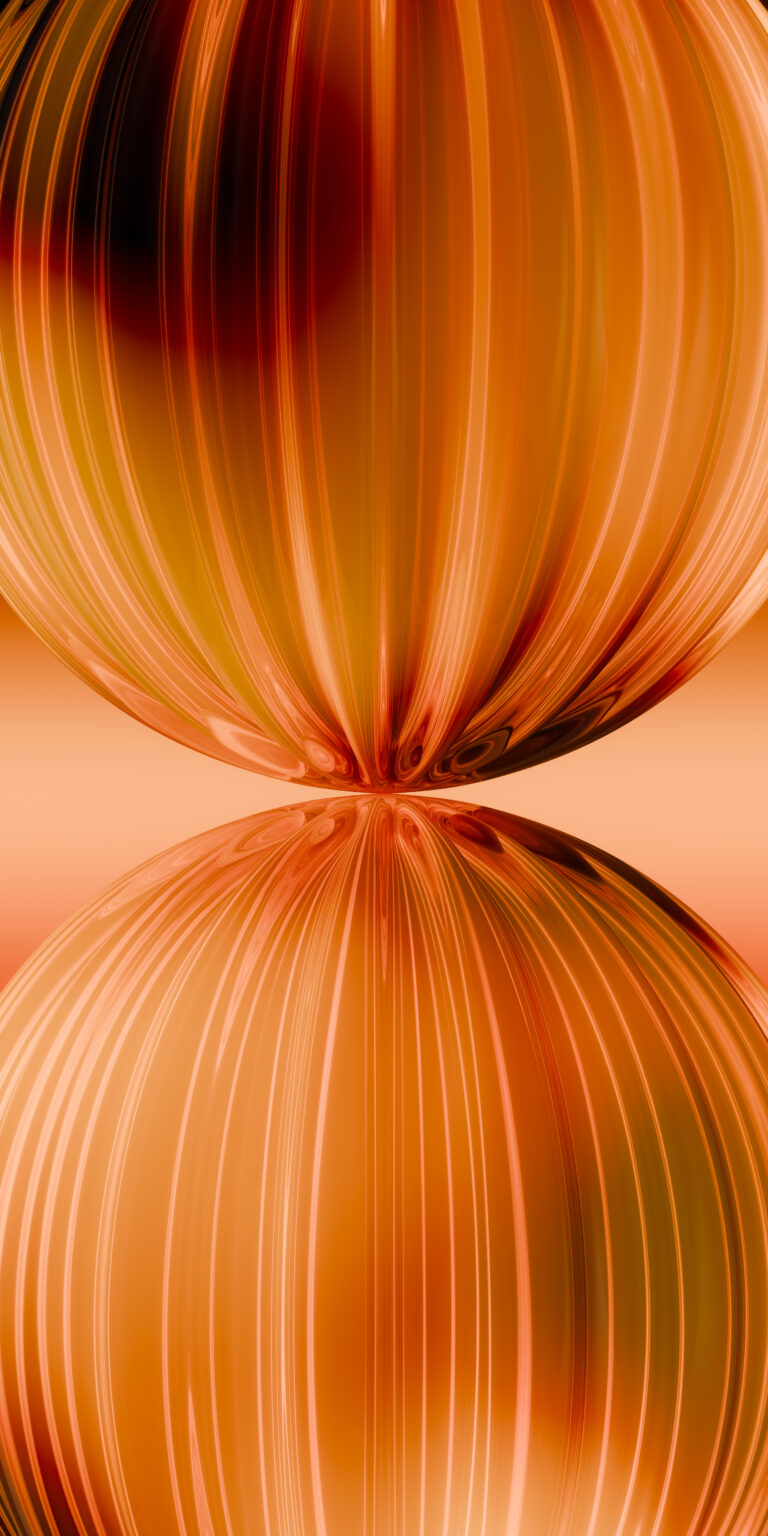
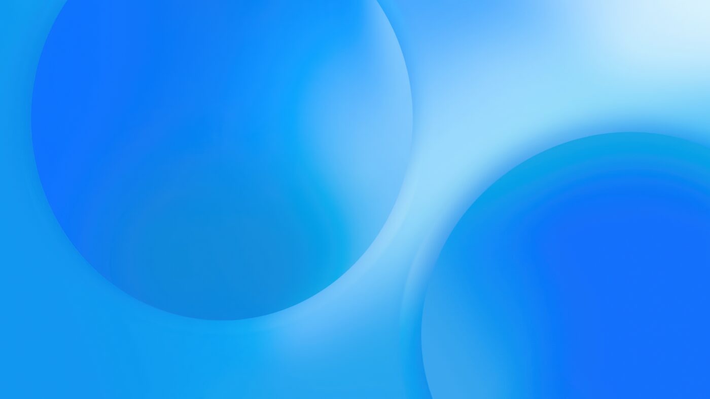
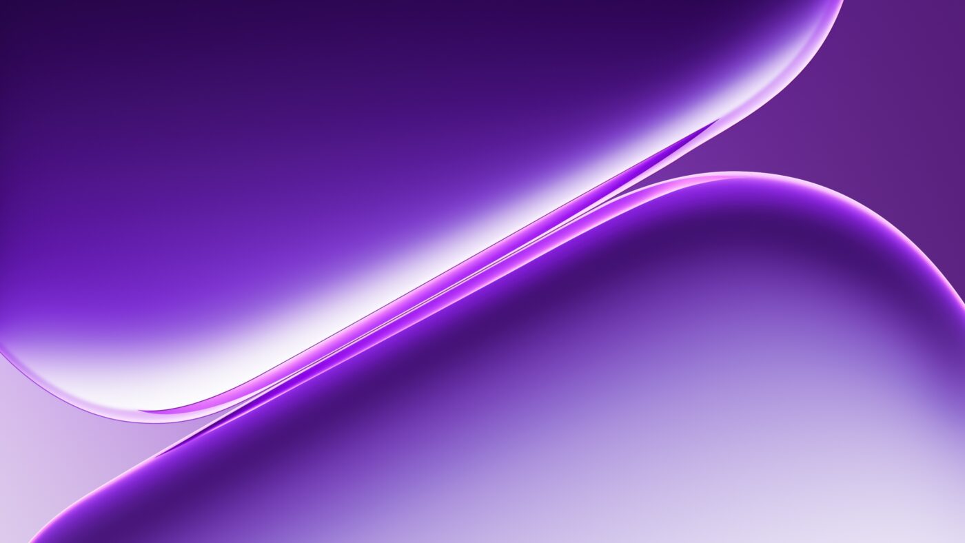
Gradients embrace that role. They create atmosphere without demanding attention. A deep purple drift behind your windows makes the whole screen feel cohesive. A warm orange fade makes your workspace feel different at 6pm than it does at 9am.
The practical advantages
Gradients compress well. They don’t have noise or grain that gets destroyed by JPEG compression. They scale cleanly to any resolution. A gradient that looks good at 1080p looks just as good at 4K because there’s no detail to lose.
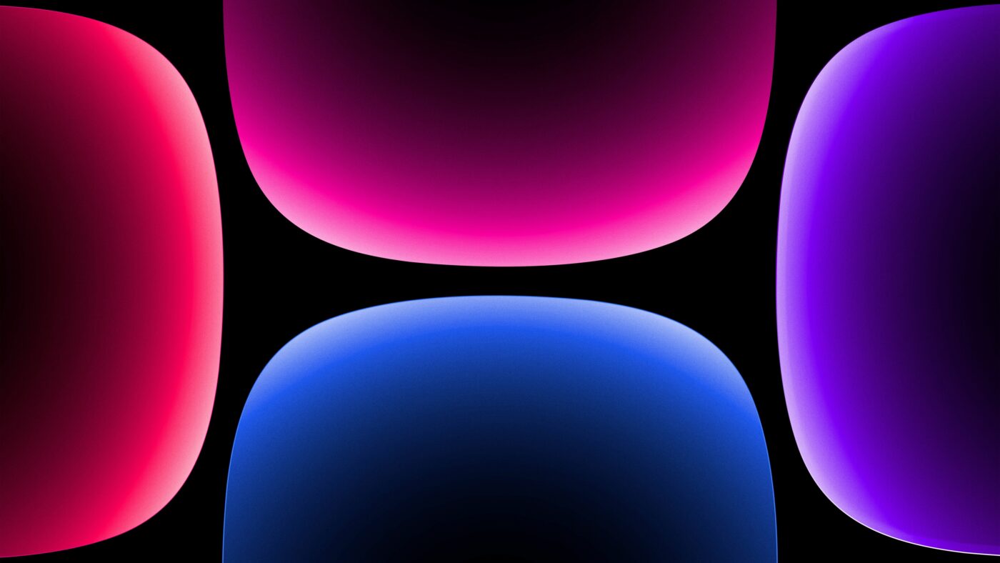
And on OLED screens, gradients with dark regions save battery. Literally. Those pure black areas mean pixels that are turned off. A gradient that fades from deep blue to black is both beautiful and power-efficient.
There’s also the icon readability factor. Gradients tend to have calm, uniform edges — exactly where your desktop icons sit. Unlike a busy photo where a tree branch or cloud might clash with your icon labels, a gradient gives icons a clean backdrop to rest on.
Matching gradients to your mood
This sounds soft, but it’s real: color affects how your workspace feels. Cool blues and teals feel focused and clean. Warm oranges and pinks feel creative and energizing. Dark gradients with a single accent color feel minimal and serious.
Some people swap gradients by time of day or task. A bright gradient for morning creative work, a dark one for evening deep focus. It takes five seconds to change and it shifts the feel of your entire screen.
If you’ve never tried a gradient wallpaper, start with something dark and simple. Give it three days before you judge it. You might find that the wallpaper you stop noticing is exactly the one doing its job best.
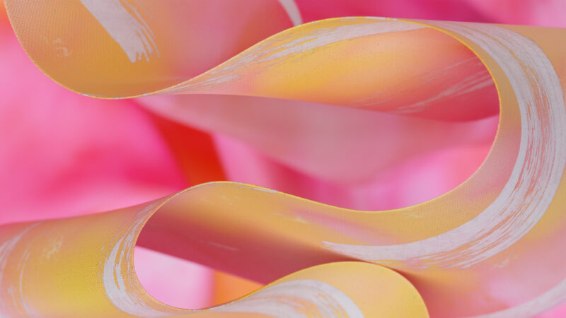
Browse our gradient wallpapers, check out the Blue Gradient collection, or explore Fluid Art wallpapers for something with more movement.